
The Challenge
Create a distinctive t-shirt design for a local cycling group composed of fathers who ride together. The design needed to capture the playful spirit of the group’s name—Poppa Wheelies—while creating a wearable design that the members would be proud to sport during rides and social gatherings.
Concept Development
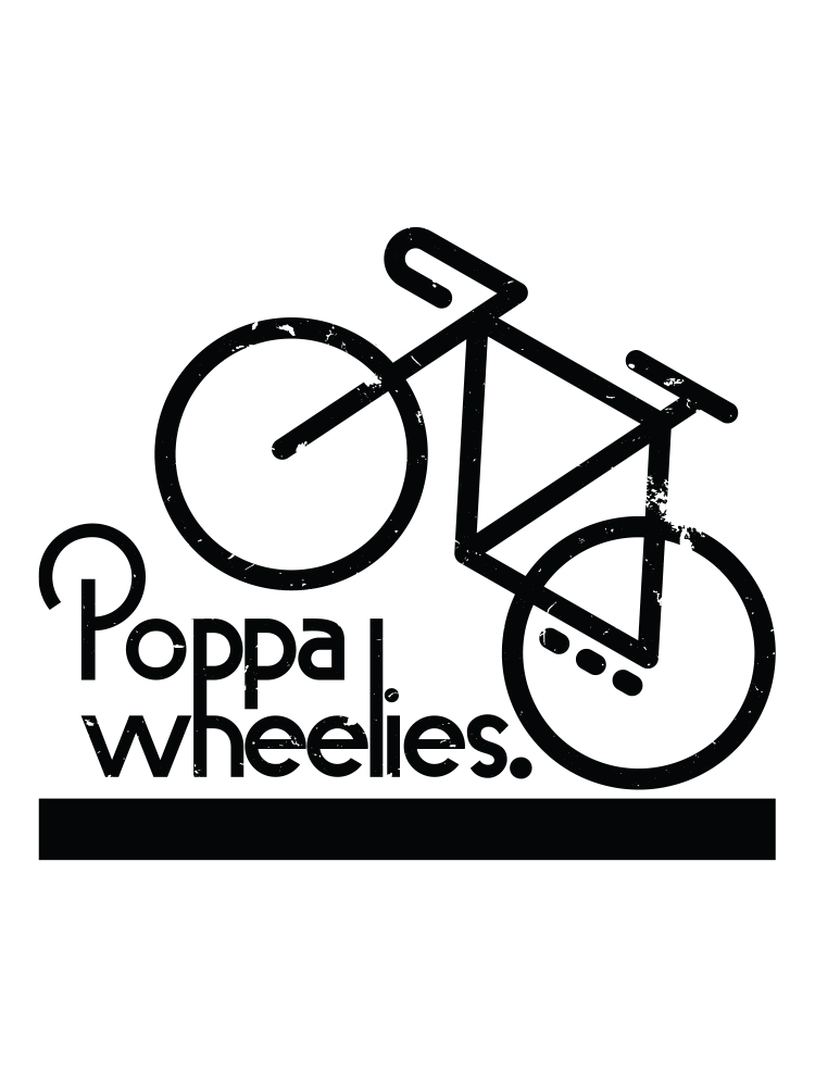
The concept centered on creating a visual pun that would connect the “Poppa” aspect with cycling imagery. I developed an approach that integrated a stylized bicycle illustration with typography that reflected both the active energy of cycling and the casual camaraderie of the group. The design needed to be bold enough to be recognizable at a distance while riders were on the road.
Design Approach
I created a clean, linear illustration of a bicycle with a deliberately distressed, hand-drawn quality to give it character and an approachable feel. The typography balances playfulness with readability, using a combination of weights and punctuation that adds personality to the name. The overall composition places the bicycle above the text to create a balanced, iconic mark that works well on a t-shirt format.
Results
The design was screen printed at Sidekick Stickers in Cranbrook, which allowed for high-quality production on appropriate apparel for active use. Working directly with a local printer ensured exceptional print quality and durability—essential for a design that would be worn during physical activity and frequent washing.
This project marked my first t-shirt design, and the positive reception from both the client and group members demonstrated the effectiveness of the simple but meaningful concept. The limited production run created a sense of exclusivity for the group members, strengthening their identity as a cohesive cycling community.