
The Challenge
A friend who works as a timber frame carpenter and home builder needed a professional logo to help attract larger projects. Despite having built a strong reputation through his craftsmanship, he lacked a formal brand identity that would enable him to compete for more significant opportunities and communicate his quality standards to potential clients.
Concept Development
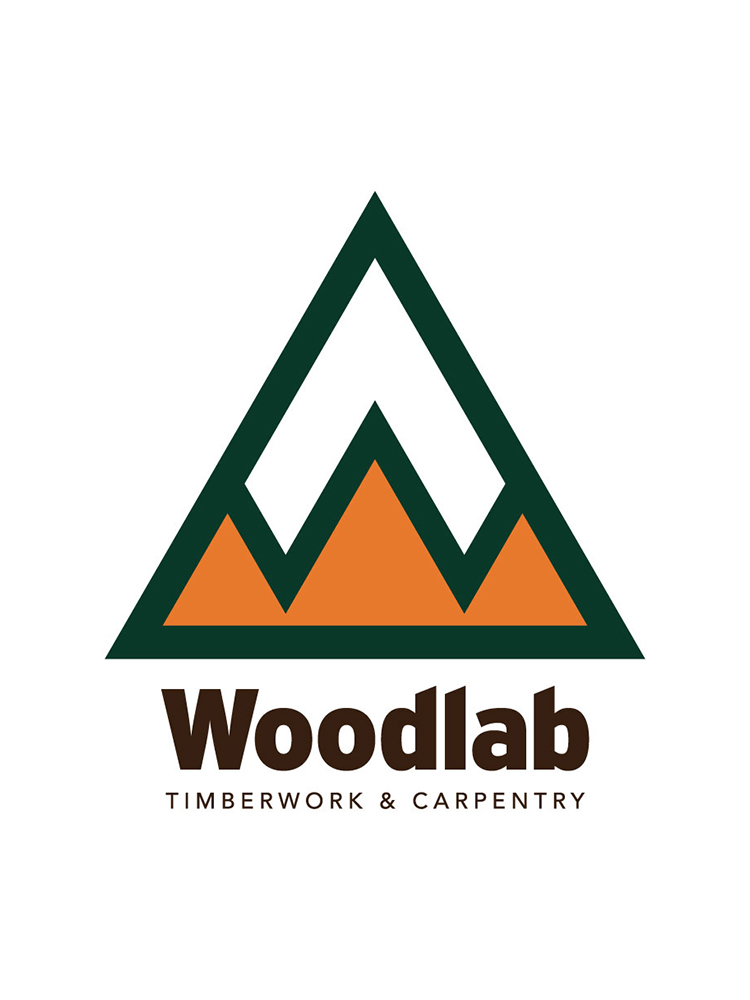
The concept needed to reflect the craftsman’s connection to the Kimberley/Cranbrook area, specifically incorporating a reference to the iconic Fisher Peak mountain. I wanted to subtly integrate a “W” into the mountain range design, while also creating a shape that would feel familiar and nostalgic. The client specifically requested a color palette inspired by his beloved Volkswagen van that held personal significance—representing travel, mountains, and quality craftsmanship memories.
Design Approach
I developed a triangular mountain motif that successfully incorporates both the regional landmark and a subtle “W” form within the mountain silhouette. The color palette features rich forest green representing the natural environment and woodworking tradition, complemented by warm orange and deep brown tones that reference the client’s cherished Volkswagen van. The bold typography communicates strength and reliability, with “TIMBERWORK & CARPENTRY” clearly positioning the business.
Results
A secondary version of the logo was created for distance visibility and smaller applications, featuring a simplified rectangular format with rounded corners reminiscent of vintage VW bus aesthetics. This alternate lockup maintains the core brand elements while optimizing legibility at smaller sizes, on vehicle signage, and from a distance—providing practical versatility for a construction business.
