
Chameleon Ad: Perfect Color Match Campaign
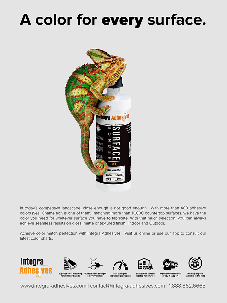
This back page advertisement for ISFA Magazine 2016 showcases Integra Adhesives’ exceptional color-matching capabilities through a striking visual metaphor featuring their specialized “Chameleon” formulation.
The Challenge
In the competitive countertop fabrication industry, Integra Adhesives needed to distinguish their color-matching technology from competitors. The goal was to create an advertisement that would cut through the visual noise of typical industrial product ads in trade publications while highlighting the brand’s unique color-matching precision.
Concept Development
The creative concept leveraged the product’s name—”Chameleon”—to create an immediate visual connection to its primary benefit: adaptability to any surface color. The chameleon, nature’s master of color transformation, provided the perfect metaphor for a product designed to blend seamlessly with various countertop materials.
The visual of a chameleon physically embracing the product bottle creates an instant understanding of the product’s purpose without requiring technical explanation. The headline “A color for every surface” reinforces this message succinctly.
Design Approach
I created a clean, minimalist design that allows the chameleon and product to remain the focal points. The white background eliminates distractions and creates high contrast with the vibrant colors of the chameleon, highlighting the product’s color versatility. The icon set at the bottom provides supporting information about additional product benefits while maintaining visual hierarchy.
The ad deliberately breaks from the industrial aesthetic typical in ISFA Magazine, using rich imagery and negative space to command attention on the back cover—premium placement that required a premium visual approach.
Strategic Messaging
The body copy reinforces Integra’s extensive color library (over 400 adhesive colors matching more than 10,000 countertop surfaces), positioning the brand as the definitive solution for color-matching challenges. The message that “close enough is not good enough” speaks directly to the perfectionist mindset of fabrication professionals.
Results
This advertisement was a remarkable success, earning featured placement on the rear cover of ISFA Magazine and receiving occasional reprints to this day. The campaign effectively distinguished Integra from competitors while highlighting the specialized Chameleon formulation, driving increased interest in the company’s color-matching technology.